← Back to projects

Was It Worth It?

A check-in app that interrupts the scroll to ask one honest question and what nine people taught us when we put it in front of them.

Role
UX Designer and Researcher
Timeline
8 weeks
Team
Solo Project
Tools
Figma, UX Tweak
Overview

The Objective

“Was It Worth It?” is a mobile check-in app that interrupts a person's social media scrolling session and asks them to reflect on how the session made them feel. Rather than simply blocking apps after a time limit, it prompts a quick “was it worth it?” notification and logs the response. These responses turn those check-ins into weekly reflections so people can see which platforms tend to leave them feeling worse.

Designed to combat doomscrolling, the application halts users mid-scroll to prompt emotional reflection. By utilizing intrusive notifications and providing concrete usage and reflection data, it offers clear insights into their actions. Confronting the negative emotions that arise from scrolling ultimately enables users to change their habits.

Primary audience: young adults, 18–28, largely college students and early-career professionals the group with the highest reported daily usage and the most on the line when scrolling collides with a deadline or a night's sleep.

Constraints: tested against a deliberately wide age range (24–70) beyond that primary audience, to stress-test the concept against more than one relationship to social media.

Research

Discovery

The objective of of testing was to measure, quantitatively, users could complete the app's core flows without guidance. These users would respond to a check-in interruption, logging how a scrolling session felt, adjusting the time-limit setting, reading their own reflection data, and configuring which platforms are tracked.

This study combined moderated and unmoderated usability testing methods. For the moderated sessions, six participants were provided a printed sheet with scenarios and used the Figma prototype on a mobile device while being recorded. For the unmoderated testing, three participants completed the evaluation remotely using shared links. Participants in both study groups completed pre- and post-test questionnaires to evaluate the prevalence of the problem and assess how effectively the application fits into their daily routines.

Research methods:

  • Round 1: low fidelity wireframes, moderated with 6 testers
  • Round 2: clickable hi-fi prototype, moderated and unmoderated with 6 testers
Jamie persona photo

Jamie Chen, 20

College junior, marketing major
Goal
  • Wants to feel less foggy and actually finish assignments before 2 am.
Pain point
  • Opens TikTok for "only 5 minutes" between study sessions, only to lose 90 minutes.
Habit
  • Opens TikTok for "only 5 minutes" between study sessions, only to lose 90 minutes.
Devon persona photo

Devon Smith, 26

Junior software engineer
Goal
  • Wants real downtime that leaves him rested, not drained.
Pain point
  • Uses Reels to decompress after work, but it never feels like a real break.
Habit
  • Scrolls during commute, lunch, and every idle moment at his desk.
Sofia persona photo

Sofia Walker, 23

First-year nurse
Goal
  • Needs a genuine mental reset after emotionally heavy 12 hour shifts.
Pain point
  • Scrolling numbs her out but leaves her more anxious, not calmer.
Bio
  • Doom scrolls immediately after work as an escape from the day.
Ideate

From paper to pixels

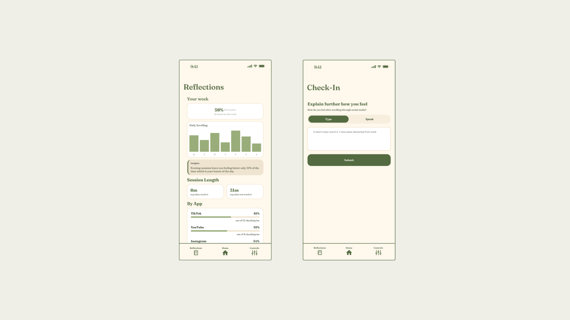
The visual redesign leans into four colors. Deep olive for focus and sage for gentle affirmation, warm tan for structure, and cream for a screen that reads as a pause rather than another feed to consume.

A serif display face carries the moments that need warmth headlines, the confirmation screen, the reflection prompt

Was It Worth It? style guide showing colors, type, and UI components
Ideate

The five tasks

Each participant stepped into a short scenario, then attempted the task cold.

  1. 01
    Leon is a software engineer who tends to lose track of time on TikTok late at night, which he suspects is wrecking his sleep. He's in bed scrolling and has already blown past the point where he meant to stop. He’s snapped out of his scrolling haze.
    Task: Respond to the app's interruption after scrolling
  2. 02
    Leon is a software engineer who tends to lose track of time on TikTok late at night, which he suspects is wrecking his sleep. He's in bed scrolling and has already blown past the point where he meant to stop. He’s snapped out of his scrolling haze.
    Task: Respond to the app's interruption after scrolling
  3. 03
    Dana is a marketing manager mid-deadline who opened YouTube Shorts for a couple of minutes while waiting for a file to upload. She notices her attention has strayed from her original task and finds it beneficial to adjust the timer to better fit her scrolling habits, setting it to 20 minutes.
    Task: Change the app’s timer to 20 minutes
  4. 04
    Aisha is a freelance designer who's been using the app for a few weeks as part of a bigger push toward healthier digital habits. It's Sunday evening, her usual time to reflect, and she wants to know if any of this is actually working before she decides whether to keep going.
    Task: Find out which platform tends to leave her feeling worst
  5. 05
    Tim is a privacy-conscious parent who just downloaded the app but doesn't want to hand over broad access to their accounts right away. Tim wants to be selective about what gets tracked before committing to anything more.
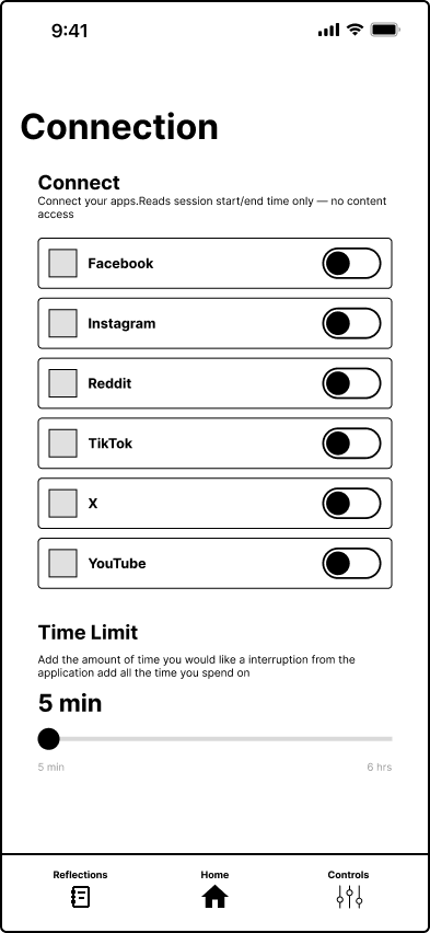
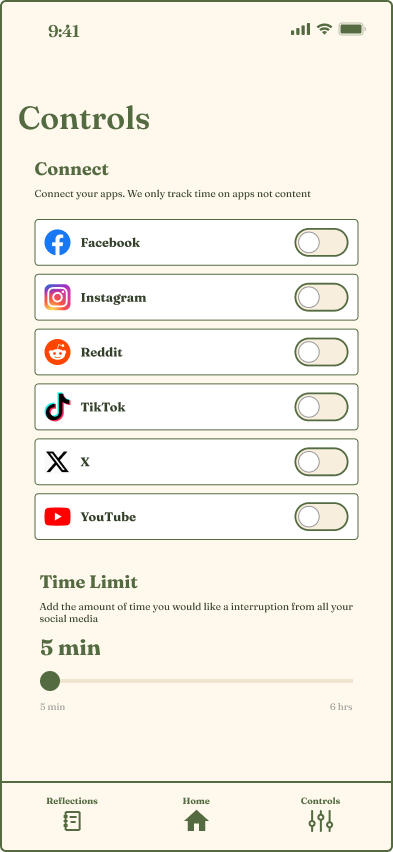
    Task: Set up the app to track only Instagram while keeping other platforms disconnected
Ideate

Three page types

Each Page type was planned out to better understand the workflow.

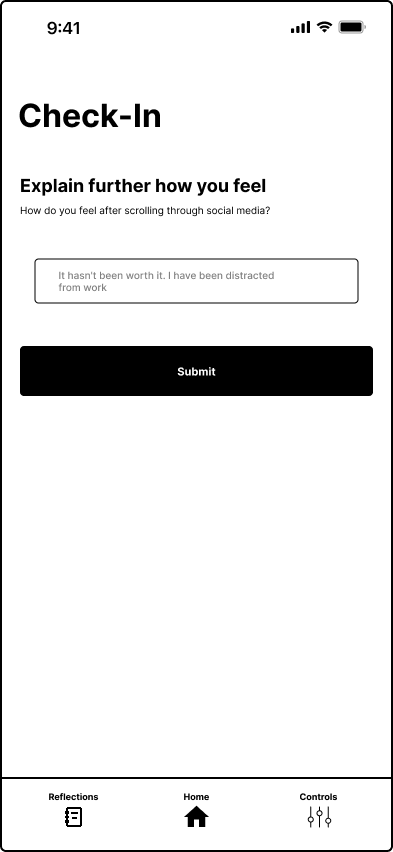
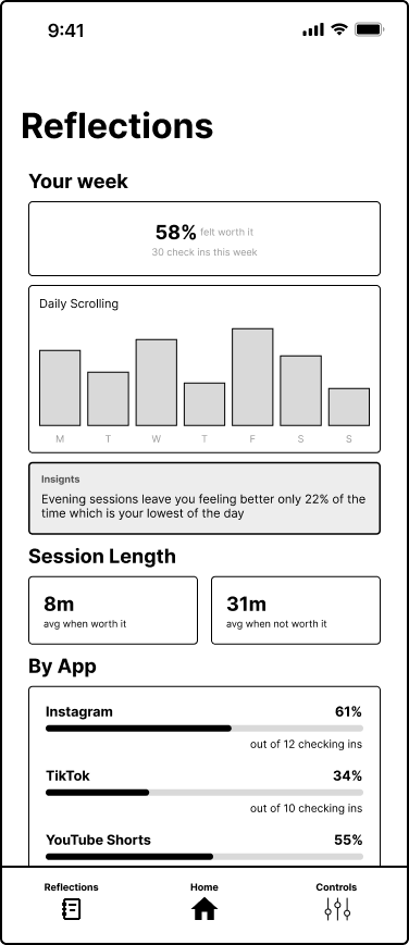
Low Fidelity

Low fidelity main screen
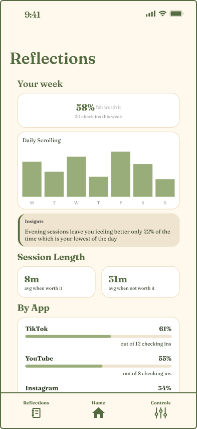
Low fidelity reflections screen
Low fidelity controls screen

High Fidelity

High fidelity main screen
High fidelity reflections screen
High fidelity controls screen
Check-In
One honest yes or no question, with an optional voice or text follow-up right after closing an app.
Reflections
Which platforms tend to leave a session feeling worse, and when.
Controls
Per-app tracking toggles and the scroll time limit, kept separate so access stays opt-in.
Data

What the pre and post test numbers said

Before touching the prototype, participants confirmed the problem was real. After using it, the picture got more complicated.

2.8 hrs
Average estimated daily social media use across participants
100%
Had opened an app "briefly" and lost 30+ minutes without noticing
14%
Currently use any screen-time or app-blocking tool
28.6%
Believed repeated "was it worth it?" prompts would actually change their behavior over time
Ease of understanding6.6 / 10
Likelihood to use if free6.6 / 10
"Would change my behavior over time"28.6%
Test

Round 1: Low Fidelity Prototype

Five testers walked through hand-drawn screens on index cards before a single pixel was designed cheap enough to throw away, real enough to expose problems early.

What informal testing found

  • Participants found the application’s concept compelling because of the problem's relevance today. Many remarked on how the scenarios directly related to their own lives, noting that they frequently engage in excessively scrolling sessions
  • A distinct age-related gap was observed in participants' understanding of the application's mechanics. Specifically, the two older participants had more difficulty locating buttons in the interface, whereas younger participants generally found certain buttons visually intuitive.
  • While most participants were comfortable navigating standard mobile apps, they hesitated here because they had never encountered a behavioral health application of this kind before. Specific components, such as the UI within the reflections tab, require more attention
  • The Reflections Tab posed the most significant usability challenge, with most participants struggling to understand the information displayed. While some individuals were completely unable to interpret the data, those who did manage to understand it reported that it required a lot of cognitive effort.
Test

Round 2: High Fidelity Prototype

Five testers walked through hand-drawn screens on index cards before a single pixel was designed cheap enough to throw away, real enough to expose problems early.

Task Avg. time
1. Answer Interruption 1:11
2. Log Scrolling Session 1:32
3. Change Timer 1:07
3. Reflection 0:56
3. Control Permissions 0:58
Total per tester 5:44
What We Found

Three problems stood between people and the point of the app

All three findings trace back to the same root cause: the prototype asks people to reflect, but doesn't yet give them a stable, legible place to do it.

The Reflections screen reads backwards

Task 4 asked participants to find which platform left them feeling worst. Just 43% picked correctly the layout's visual hierarchy pointed people toward the opposite conclusion the data actually supported, and there was no confirming state once they'd "finished" the task.

57%answered incorrectly
43%identified the right platform

People get stuck looping between the same screens

The absence of clear orientation markers or a "home" state meant users defaulted to revisiting previous screens in an attempt to reset or find an exit, resulting in the observed circular navigation patterns. Task 2 logging how a session felt took the longest of any task on average, largely because it was most people's first real encounter with the flow.

1m 32saverage time on Task 2

Two entry points look like one

Task 1 simulated an active interruption mid-feed within a social media environment, whereas Task 2 required launching the check-in directly from the standalone application after closing a platform. Participants repeatedly failed to distinguish between these entry points due to visual and structural ambiguities across the two interface flows.

Recommendations

What each finding points to

Finding Recommendation
Reflections is unreadable Reformat the Reflections page to prioritize actionable insights, simplify data visualization to show clear platform comparisons. Add prominent navigation buttons to improve discoverability.
Users get stuck looping between the same 2–3 screens Implement clear success/confirmation states and persistent exit buttons on every screen to prevent users from getting stuck in navigation loops.
Visual miscommunication first two tasks Introduce distinct visual cues for the different entry points to reduce user confusion regarding task context.
What Surprised Us

Two findings that weren't on the research plan

It's not just social media

Older participants pushed back on the framing. Their doomscrolling wasn't TikTok it was news sites and the links that follow them out of an email inbox. The underlying pattern, an algorithm-shaped absence of a stopping point, isn't unique to social platforms. It suggests the eventual scope of the tool may need to widen past the apps it started with.

Reflection can read as guilt

Only 28.6% of participants thought a repeated "was it worth it?" prompt would change their behavior over time most expected to eventually dismiss it like any other notification, and several said it felt more like guilt than guidance. And yet every single participant admitted social media keeps them scrolling longer than they mean to. The demand for the tool is real; the current delivery of the question isn't yet landing the way it's meant to.

100%lose track of time scrolling
28.6%think the prompt would change that
Reflection

Conclusion

"Was It Worth It?" usability study reveals a clear demand for screen-time management tools, but highlights critical friction points within the current prototype. While participants recognize the value of the app's intent, the core navigation loops and confusing interface elements hinder the user experience. To drive long-term adoption and shift user behavior effectively, future iterations must prioritize interface clarity and workflow efficiency.